


Whoever says "text needs work"...sucks
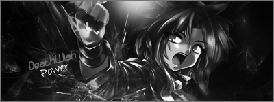

i don't LIKE the black and white stuff you should leave it with the normal color's
but the rest of the sig is good!
dont much like the b&w,blening and flow are nice,and depth is kind of decent,kinda bad =/
i know!:dry:Originally Posted by Commander_John.

..first one in a long time,gimme a break!
THE TEXTSpoiler
I also think it would've been good in color.
kiu though
:D


 Reply With Quote


Bookmarks