


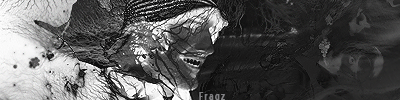
This is a Sig i did while Cameron Lane RokkerGuys Freind Talked To Me On Skype He SaidSo Umm Yea What You Guys Think..[10:31:10 PM] BLACK: what you think
[10:31:27 PM] Cameron Lane: That is the best picture I have ever seen

This is a Sig i did while Cameron Lane RokkerGuys Freind Talked To Me On Skype He SaidSo Umm Yea What You Guys Think..[10:31:10 PM] BLACK: what you think
[10:31:27 PM] Cameron Lane: That is the best picture I have ever seen
Last edited by Dubstepper; 11-18-2009 at 11:41 PM.
idk bout others but i like it
ReP + iF i HeLpEd http://www.consolediscussions.com/forum/reputation.php?p=158593
Make quick money online
http://www.neobux.com/?u=Fox1091
thanks i hate text on this but i did like the c4d and background
Ugh yea not to be a dick but not the best I've ever seen, by far.
2 light sources?
try using 1 focal
and position the light source
above the focals
its a bit chaotic i see no flow try using one focal and combine both text with & but make it look good also the lines on bg give the sig a low q look get rid of them pls make a v2 of it


 Reply With Quote


Bookmarks