


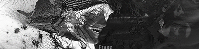
This was mostly an experimental sig.
v1:
v2:
CnC

This was mostly an experimental sig.
v1:
v2:
CnC
you using too much the pen tool and the same font try to work on that but sig loks good
colors dont really flow that well
i would have to go with v1
not bad
bg and text suck tho
Jimi Hendrix
"When the power of love overcomes the love of power, the world will know peace."

V1 looks better. If your going to use the pen tool like that you should at least follow one flow, you have quick curves at the top on a bunch of them but that one near the top laces of the shoes like hurls over and it doesn't follow the rest anymore. Text is ok, and a little bit too much smudge.
Every man for himself. You trust no one but yourself, if you want something done you do it your self don't rely on others. You watch your own back, you fight your own fights its you against the world.
Originally Posted by Some phag
ok this is the first sig I've used the pen tool in. also I couldnt find a good font.
----Added 21/11/2009 at 11:16 AM----
Ok I see what you're saying about the top of the laces.
Yeah its all at an angle on the right and then you get to the top there and you make it go straight down and it kind of throws it off a little bit. Follow it next time.
Every man for himself. You trust no one but yourself, if you want something done you do it your self don't rely on others. You watch your own back, you fight your own fights its you against the world.
yeah that was a pretty amateur mistake.


 Reply With Quote


Bookmarks