


the comic render has another name but i tru moderncowboy will be funny


the comic render has another name but i tru moderncowboy will be funny
damn.
thank you :happy:Originally Posted by B1G_BR0TH3R

not bad...
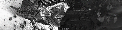
2 things that went wrong here though
* light source was poorly placed
* text
Jimi Hendrix
"When the power of love overcomes the love of power, the world will know peace."

hm nice fx,
work on txt tho
kiu!
I disagree, the light source is placed well. It makes the focal point up near the top by the head, and therefore in the middle of the image. The text is also pretty good for what he gave himself to work with, but the "dinex" part is too small and the "boy" in cowboy is blended into the background


 Reply With Quote


Bookmarks