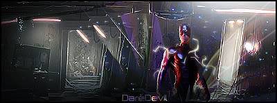
Theme
Favorite Super Hero
That means anything super hero or super heroine.
Rules
- No posting the signature until SOTW is over!
- Don't tell anyone which signature is yours if it is an anonymous contest.
- Don't talk about who's signature is who'
- Don't tell anyone to vote for you
- No voting for yourself
Entry #1
Entry #3
Prizes
1st - 50,000 VBux
2nd - 25,000 VBux


Bookmarks