


I like it what about you?
Im still tryin for GFx
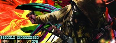
The pic is also my new sig

I like it what about you?
Im still tryin for GFx
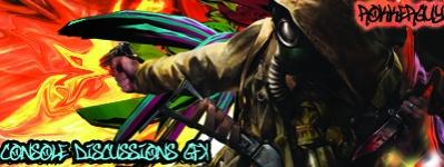
The pic is also my new sig
ur getting better, try to work on text also
Jimi Hendrix
"When the power of love overcomes the love of power, the world will know peace."

to me the blue and the purple look wierd
When I die, I want to go peacefully like my Grandfather did, in his sleep -- not screaming, like the passengers in his car. \,,/, rock on \,,/,
Work on text.
Blending is good. :)
Rep me up+ if I help or you just think im a cool guy.:)
Originally Posted by gokickadogx2
 I worked on the text
\/
Also can anyone tell me why all of the sudden Photoshop wont let me export PNG just Jpeg and PS source files can any one help:sad:
Your getting soo much better.
For text, try not to get it to distract people from the focal.
And the red and yellow not so good. You want to use colors from the render or C4D.
Other than that, you doing better [:
And the font you used, Visitor -BRK- , you don't want to use those for the big text. Visitor is meant for small text.
.: PSN iD - KaoTiiK_ReFLeX :.
your text should only be in 1 spot,where it wont draw attention away from the eyes of the person.a good place would be right above the pistol.also work with flow and depth.but you are improving,kiu.
ok ill work on doing that and as for the flow I will improve that Its gonna be an easy fix.
Thanks,
Michael P. (rokkerguy)
I kinda like how the image sticks out but i will definately try blending more colors, and thanks for the font advice.
Thanks,
Michael P. (rokkerguy)
theres to much going on and the tect is to much. it dosent blend either
Can you Feel the Bass?


 Reply With Quote


Bookmarks